Microsoft’s Brick & Mortar
Re-design of the T-Mobile checkout experience
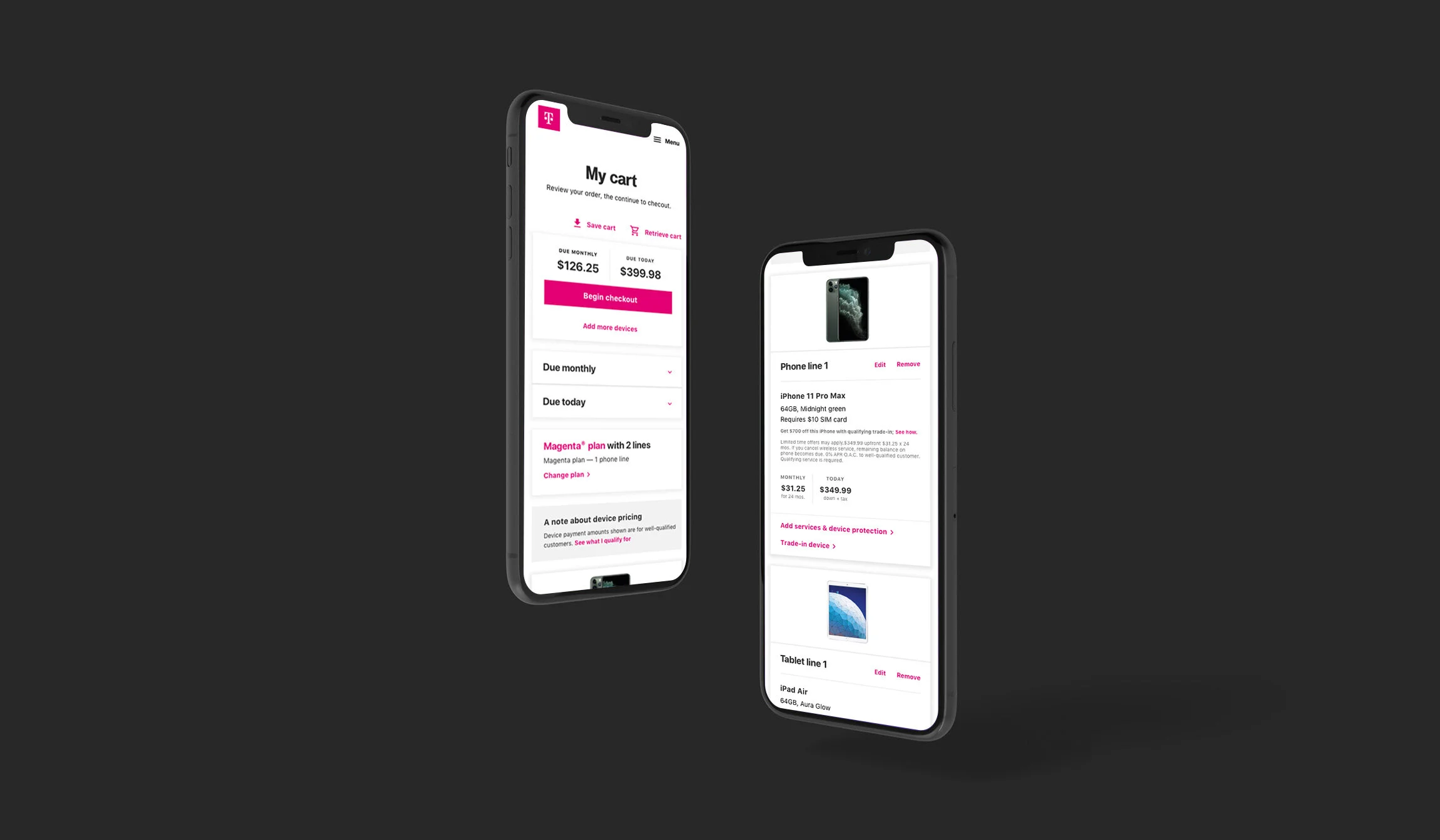
The old cart was experiencing a high volume of abandonment due to confusion around pricing and items in the cart. The new experience allows the user to choose a plan, add devices, and check out seamlessly.

MY ROLE
Lead UX Designer, Visual Designer, and Content Strategist
TIMELINE
2 months
CLIENT
T-Mobile
TEAM
Myself

PROBLEMS
The brick & mortar pages in 2018 were not orgfanized and used too many pop-ups to get customers to sign up for events. We wanted to improve page performance, while providing the customer with stronger UX.
PROJECT GOALS
The goal was to provide customers with an easy way of fidning a store and signing up for events in that store.
UX CHALLENGES
To simplify and provide more UX direction that allows the user to review their pricing, promotions, and discounts applied, while navigating restrictive functionalities.

Persona 1
First-time buyer
This is the customer’s first time through the buy flow. The goal is to convince them the check out process is simple and easy.

Persona 2
Hesitant buyer
This customer is focused on the numbers and is easily deterred by credit checks and changing payment totals. The goal is to make sure all payment amounts are explained clearly.

PROBLEMS THAT NEEDED SOLVING
“Find a store” page needed to be simplified
The current experience had confusing interactions. Event links led to landing pages that usues pop-ps to sign up.
Customers failing to move forward
43% of customers who tried to “run credit check” failed to move forward. Only 36% of the 57% of customers whoo clicked on “Run credit check” eventually reach the Shipping & payment page.
Residential address error messages
Customers are very likely to ignore the fields in “Residential address”. 50% of customers encountered error messages associated with “Residential address”.
Error states missing the mark
7% of customers had to try multiple times to pass through the credit check. They needed more indications about why they failed to move forward. On mobile, at least 10% of customers needed heavier hinting on missing or wrong inputs.
Customers were going through the hard credit check twice
13% of customers (mobile) who tried to “Run credit check” were going through twice, meaning they were clicking the XTA more than once. Only 5% were making it through “Run credit check”. It happened more frequently than that on Desktop (75).
Mobile form
The mobile form needed to be better to encourage users to fill in the form in the correct order.
PAGE STRUCTURE
We initially tested all form fields open on one page. The testing showed that users were bouncing around to form fields all over the page. We decided to truncate sections and make them steps to help guide our users.
FORM FIELD ORGANIZATION
All sections on each step of the check out flow is truncated to encourage customers to fill out the form fields in order. This proved to be helpful in getting customers through the flow.
PROGRESS BAR
Building on the legacy experience, the new progress back is smaller and more lean, providing the customer with visibility on what is next.
YOUR UPDATED PAYMENTS
After customers successfully went through the hard credit check, their pricing would usually change due to their credit. Most users showed frustration through that process since they did not understand why their pricing changed. “Your updated payments” section was designed to be front and center where customers could easily see the changes.
PHONE RECOMMENDATIONS
This section was designed to give customers other phone options that may not be as expensive. Because the main goal is to get the customer through check out, we wanted to give customers other phone options that are cheaper.
UPDATED VS. ORIGINAL PAYMENTS
Most customers are curious why their payments changed. As pricing transparency is a core value I design into each T-Mobile experience, I wanted to be clear what made the payments change — it’s all based on the customer’s credit history. If they do not go through prescreen on earlier pages, they will most likely see different payments at this stage in checkout. Because this caused fallout in the legacy experience, I used an expand/collapse design to show a comparison of payments.
REVIEW ORDER
ORDER CONFIRMATION
SHIP
If the customer chose a shipping option on the Shipping & Payment page, they are given the delivery address and shipping method.
PICK UP
If the customer chose to pick up their order, I included a map for the store’s location, their appointment time, store address and all store information. They have previously chosen their appointment time prior to submitting their order.
PROBLEMS THAT WERE SOLVED

Solve 1
Lorem sipu dolores ameton conseuare lorem ipsum dolore amet. Lorem sipu dolores ameton conseuare lorem ipsum dolore amet.

Solve 2
Lorem sipu dolores ameton conseuare lorem ipsum dolore amet. Lorem sipu dolores ameton conseuare lorem ipsum dolore amet.

Solve 3
Lorem sipu dolores ameton conseuare lorem ipsum dolore amet. Lorem sipu dolores ameton conseuare lorem ipsum dolore amet.

Solve 4
Lorem sipu dolores ameton conseuare lorem ipsum dolore amet. Lorem sipu dolores ameton conseuare lorem ipsum dolore amet.

Solve 5
Lorem sipu dolores ameton conseuare lorem ipsum dolore amet. Lorem sipu dolores ameton conseuare lorem ipsum dolore amet.

Solve 6
Lorem sipu dolores ameton conseuare lorem ipsum dolore amet. Lorem sipu dolores ameton conseuare lorem ipsum dolore amet.
BEFORE & AFTER
Lorem ipsum dolor sit amet, consectetur adipiscing elit, sed do eiusmod tempor incididunt ut labore et dolore magna aliqua. Ut enim ad minim veniam, quis nostrud exercitation ullamco laboris nisi ut aliquip ex ea commodo consequat. Duis aute irure dolor in reprehenderit in voluptate.


