Microsoft Homepage
A design refresh of the Microsoft Homepage
As part of the MSCOM team at Microsoft, I created the Microsoft.com homepage using Microsoft's most recent design standards, Microsoft Web Framework (MWF). While designing, I upheld the new framework and also elevated Microsoft's brand.
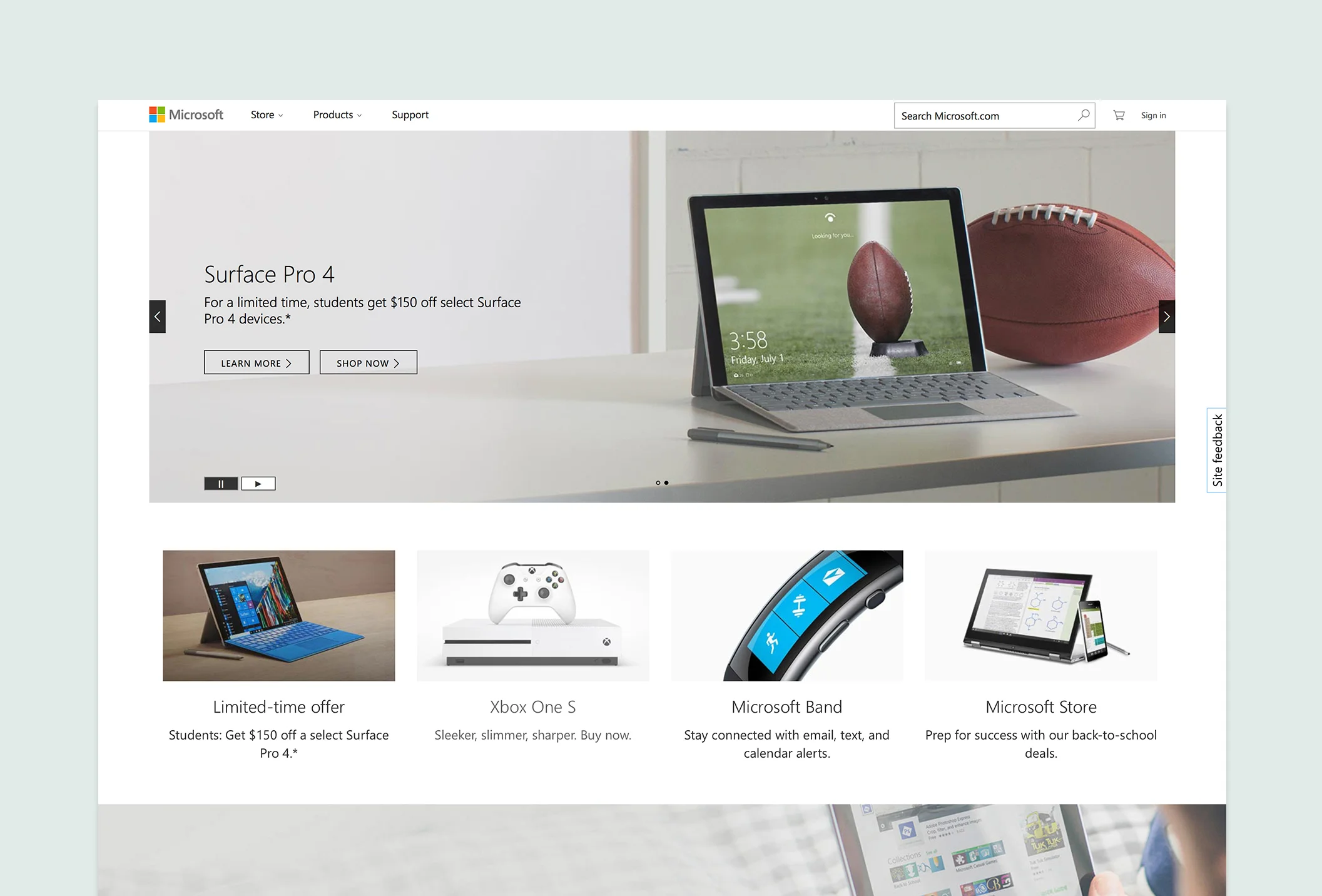
THE PROBLEM
The old Microsoft homepage was very busy. A bar at the top of the page was included to help users find the assumed most popular links, but testing proved it unsuccessful. With an array of bold colors, the homepage felt heavy users had a hard time digesting the information.
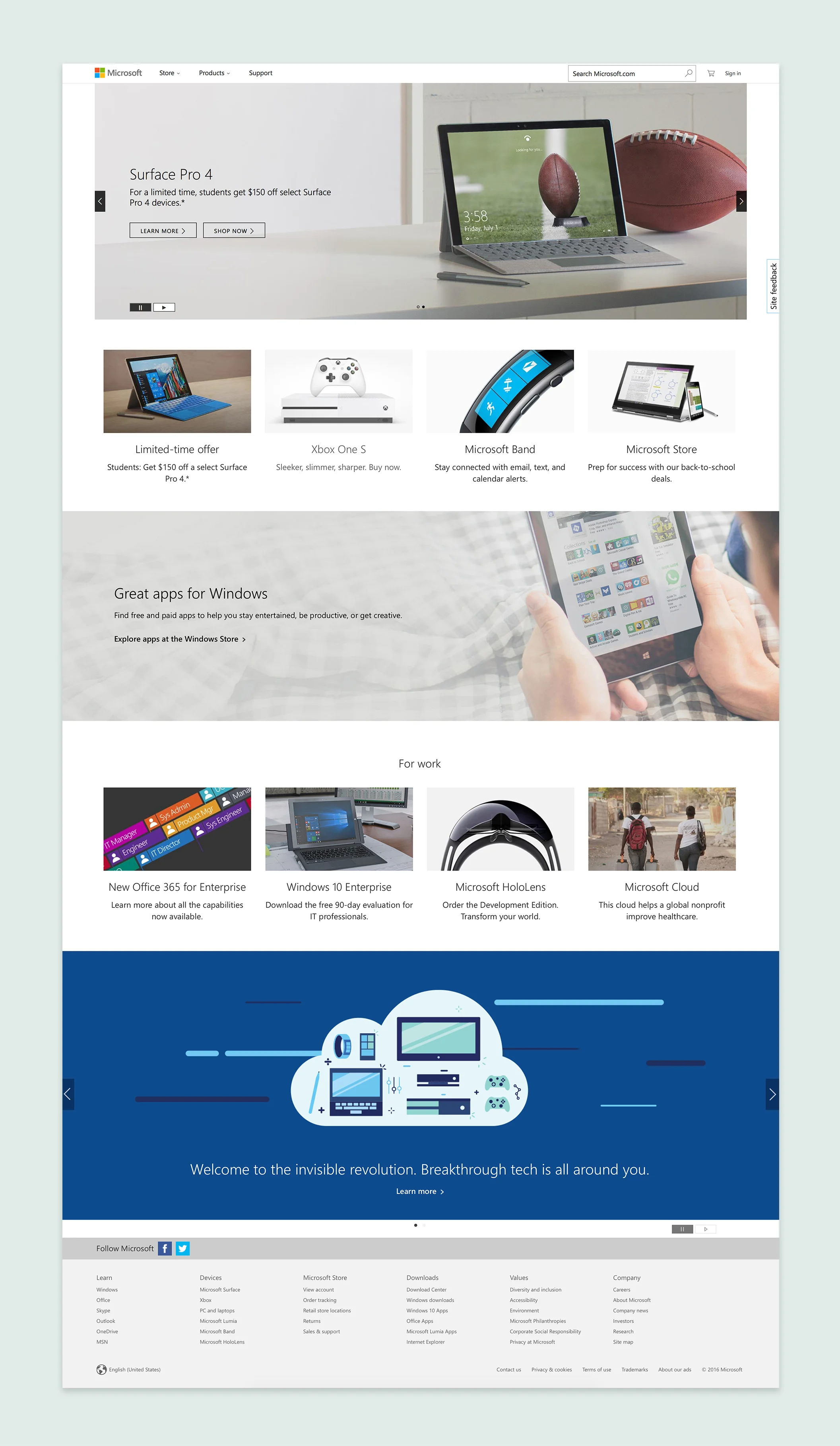
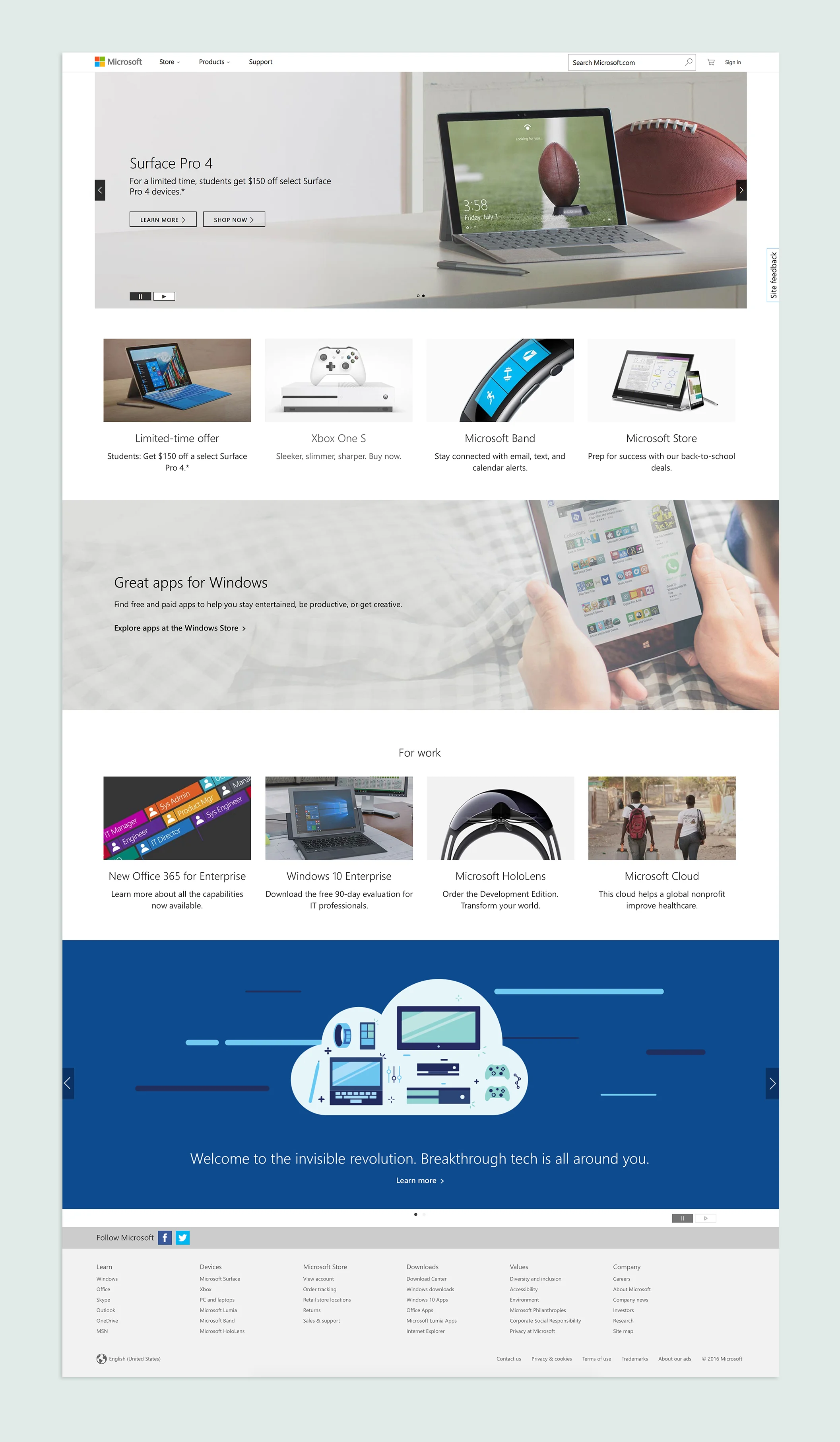
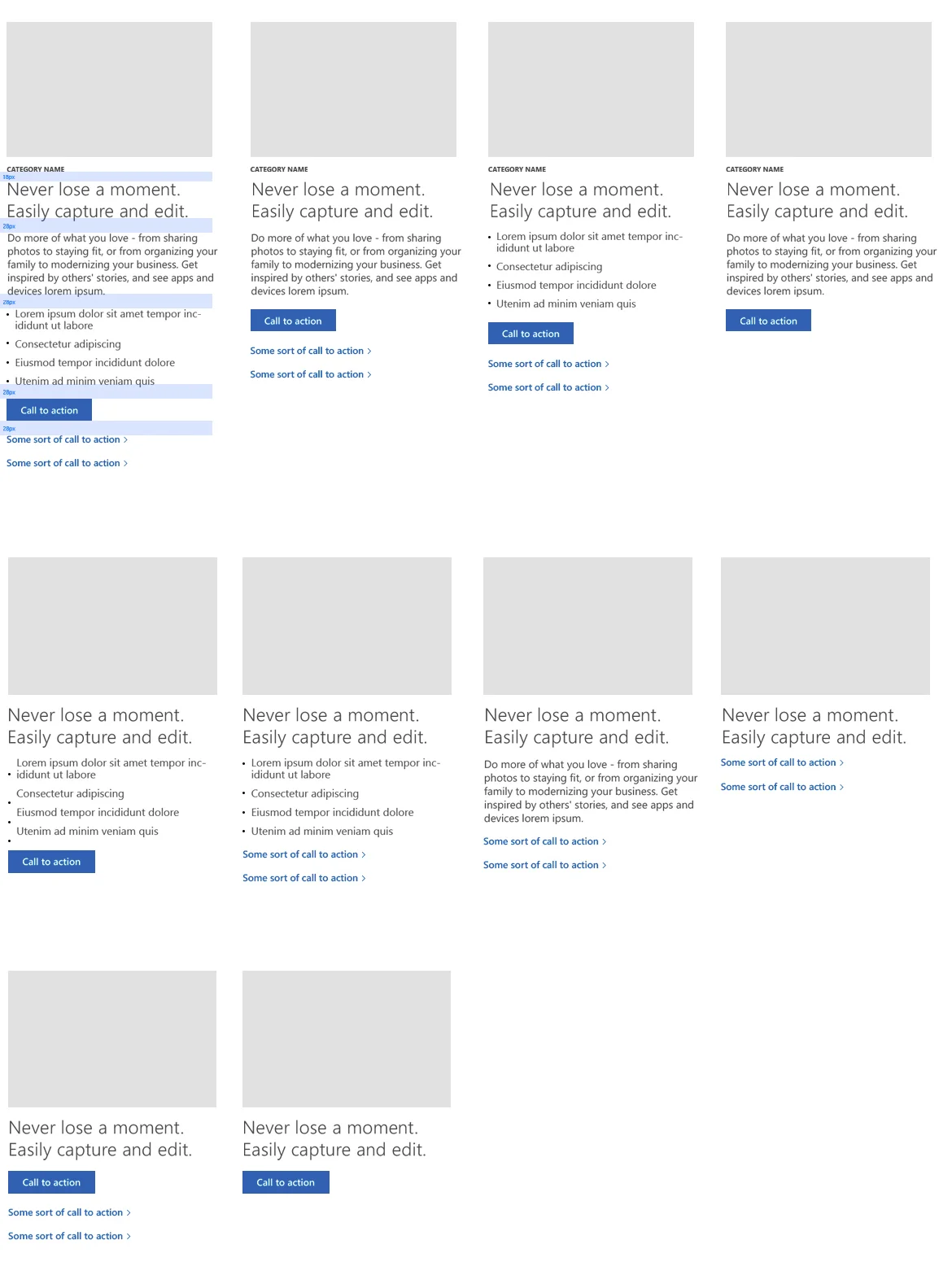
TEXT SPACING
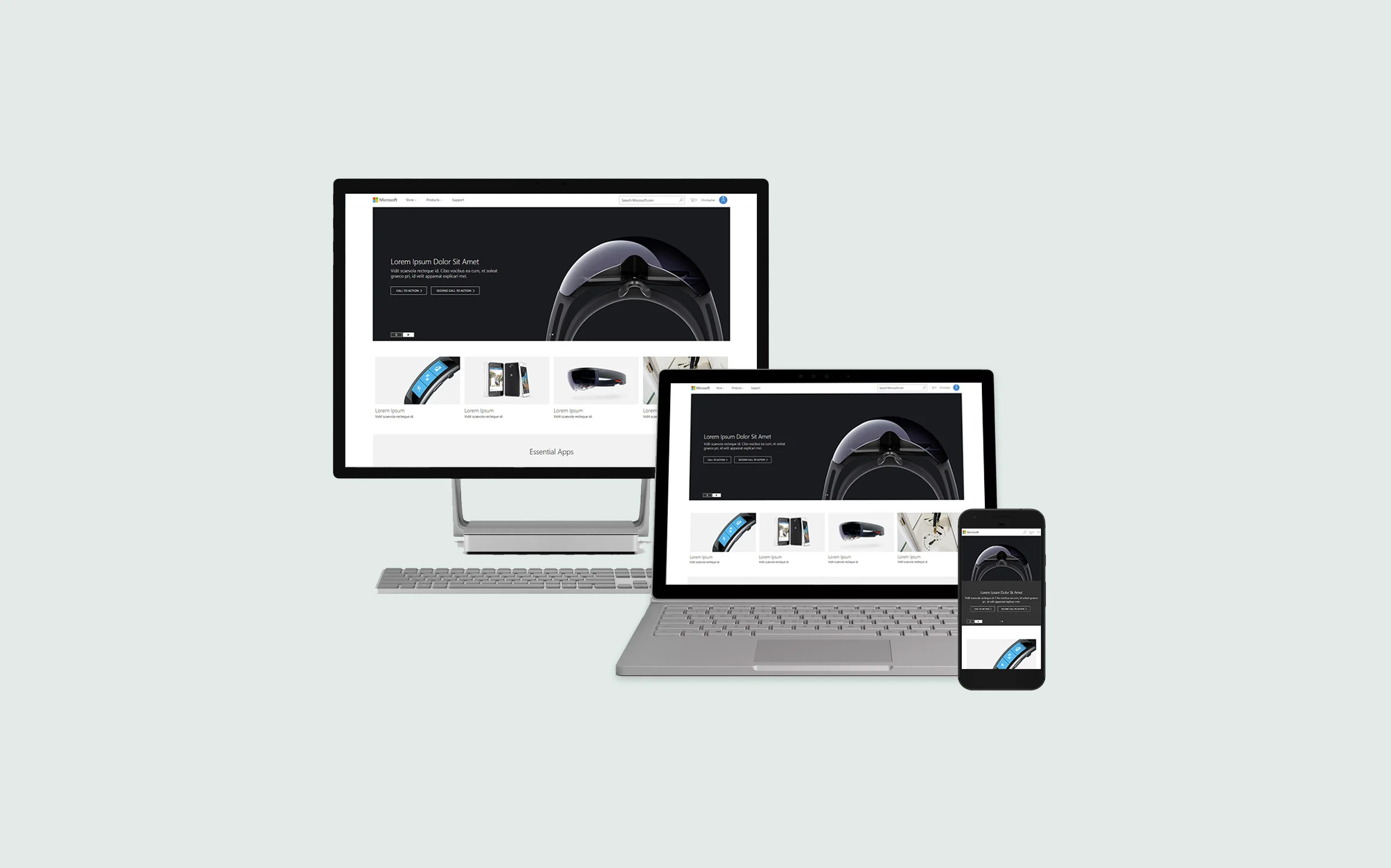
I was responsible for defining the pixel-perfect text spacing and the icon font ramp for all breakpoints and devices. Being knowledgable of Microsoft’s Web Framework, I helped the team layout the page and ensured proper spacing and pixel-perfect design.

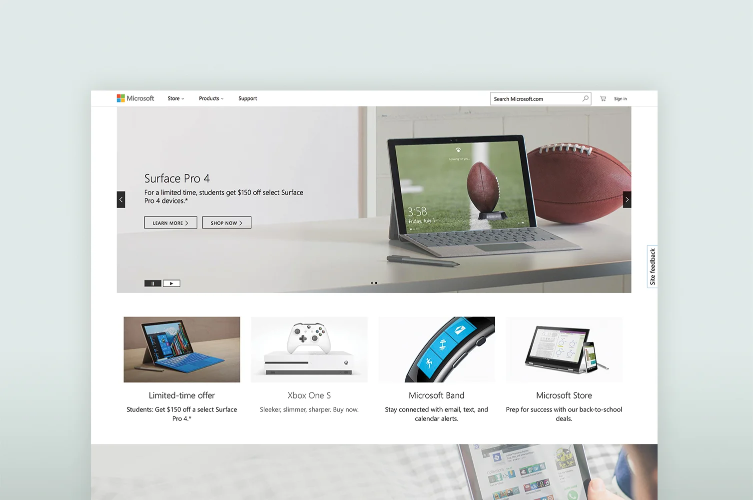
THE SOLUTION
Crisp and simple product imagery was used and text was formatted to be on a while background With correct spacing. The top bar was removed due to its lack of use, and a highlight section was designed in the middle of the page to draw users to current and upcoming campaigns.