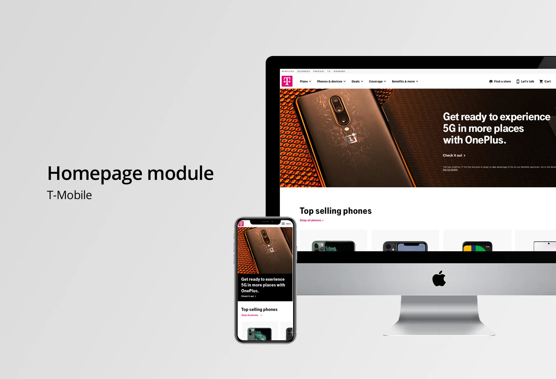
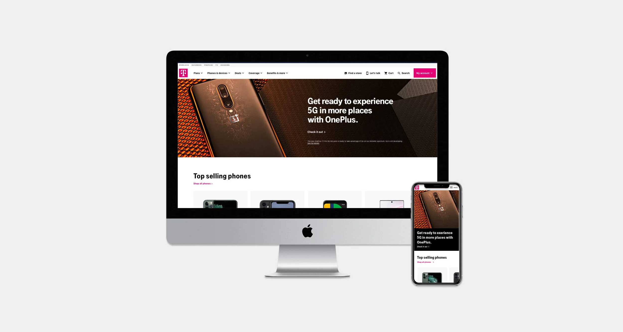
T-Mobile Homepage
Top selling phones module addition to the Homepage
I spearheaded the initiative to add a “Top selling phones” section on the T-Mobile homepage to encourage customers to shop phones and enter the buy flow.
My Role
Lead UX Designer, Visual Designer, and Content Strategist
Timeline
3 weeks
Team
Myself and Development team

Problem
The T-Mobile homepage only featured five boxes that included heavy imagery and CTA’s. There were no phones listed as another entry point to the shop flow other than the UNAV.
Project Goals
To create new modules for the homepage that would drive users to different areas of the site — both shopping and learning. I first focused on creating a module to encourage device shopping.
UX Challenges
The challenge was creating modules that could house different types of content successfully.

When customers come to the T-Mobile website, they should be able to find everything they want and start shopping from the homepage. This new module addition allows the customer to start shopping immediately.


Module Exploration
The process for this project started by looking at the problem — there was no clear entry point to. shop besides the UNAV. I created a handful of wireframes that used modular components that could house a variety of content types.
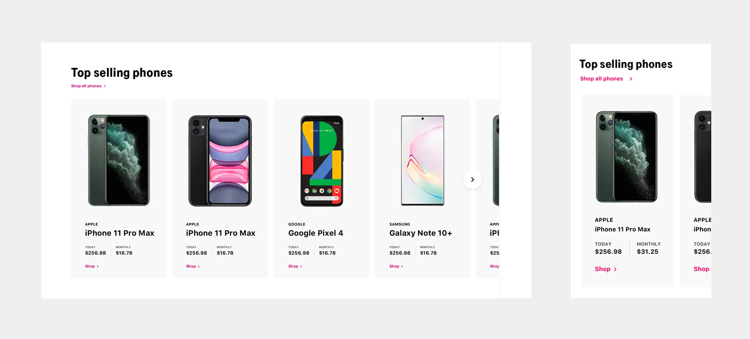
Top Selling Phone Module
Using the module above, I highlighted the phones T-Mobile sells to increase click through rate and sell more phones. I used a carousel of cards to display multiple phones with one click, allowing users to easily browse multiple phones while staying on the homepage.